
Assignment 3
Working with Spatial Data
For this project, I want to map data from a section of the Brooklyn City and Business Directory for the year ending May 1, 1880, and discuss my findings. The section comes from page 806 section 2, which are last names ranging from PIE-PIL. The reason I chose this specific section is because of my own last name, Pietrafesa. My great-grandparents (on my dad’s dad’s side) first immigrated to New York from Naples, Italy around the 1870s-80s, but my family is not sure of the exact date. Their names are Paul (Paolo) and Anna. They lived in either Brooklyn or Queens at the time. Unfortunately, while looking through the directory, I could not find my last name listed, which could indicate that they had not arrived yet, but I decided to work with this section of data anyway.
Modelling the Data
Looking at the entries was a little confusing but I was able to mostly understand what I was looking at. The data was sorted by last name, first name, occupation, then address.
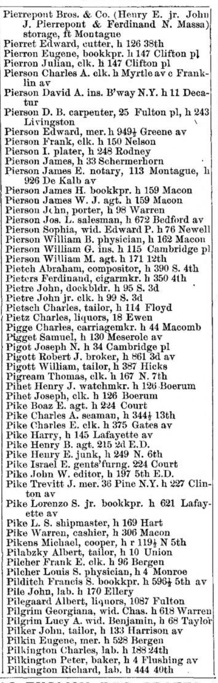
What confused me, however, was that some of the addresses had multiple streets in them. This was not a case of the address showing between which two streets the location was like in a lot of places in New York City (eg. X place is between 23rd St and 3rd Ave), these streets, when looked up, were not close to each other.

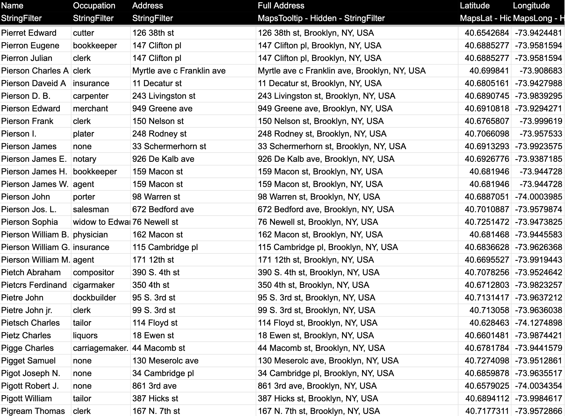
I noticed that there was an “h” in each entry which I found out was a shortening for “house,” meaning these were home addresses. I don’t believe the other address was a place of business because there were so few entries that included it. When it came to formatting the addresses later, I opted to exclude the secondary addresses. I was fortunate enough to have this data be OCR’ed, meaning I did not need to manually type in all 59 entries. When I copy-pasted the data into Google Sheets, however, I realized right away that I would need to format the data to make it readable. It was a mess, as some parts would have fragments of an entry, while others would have several grouped into one. I could not simply separate each by a symbol because entries would either be separated by a comma or a period when names or occupations were abbreviated. What I ended up doing was pasting the raw data into a Google Docs document and manually formatting each entry by putting line breaks where needed. The second step was to add separators so that Google Sheets could properly split up the data into columns. I did this by simply adding commas after any periods where there were abbreviations. I noticed that some listings had only names and addresses, so I assumed that this meant that they had no current job. I just added a blank comma in between the name and address so that the data would format properly into Google Sheets.
Once that was done, I began formatting the rest of the data so that there would be as little errors as possible. I first started by correcting any mistakes the OCR had with spelling. After that, I wanted to unabbreviate things such as the occupations. It was weird seeing jobs such as clerk, merchant, and laborer, which aren’t very descriptive as jobs and you don’t hear today as job occupations. I also found it strange that some of the women had their occupation just listed as “widow to X”. I’m not really sure why widow is listed as an occupation. Once this was done, all that was left was to format the addresses, which was the messiest part. The first thing I noticed was that certain numbers were abbreviated differently than they are today. The main ones being 2nd and 3rd, which were instead written as “2d” and “3d”. I checked the original document to make sure this wasn’t an error on the OCR’s part, and it indeed was not. I also noticed that avenue was abbreviated as “av” rather than “ave” and corner was abbreviated as just “c”, which is usually not included in formal addresses. I also noticed that some of the numbers had ½ as part of their number address, which I did not know existed. The last thing that I saw with the addresses was that most of them simply did not have a street ending to them, like st, ct, pl, etc. I realized that there were no addresses ending in st, so I assumed that any of these missing endings were in fact ending with st. I looked up some of the street names on Google Maps to confirm this. I did not fill these in, because I thought that the geocoder might’ve been able to properly map these.
Enriching the Data
Now it was time to map the addresses onto Google Maps. I downloaded Awesome Table’s Geocoder to do this. I made a new row to concatenate “Brooklyn, NY, USA” to the end of each address to ensure that all points would be in Brooklyn. When I ran the extension and looked at the map, I saw this:
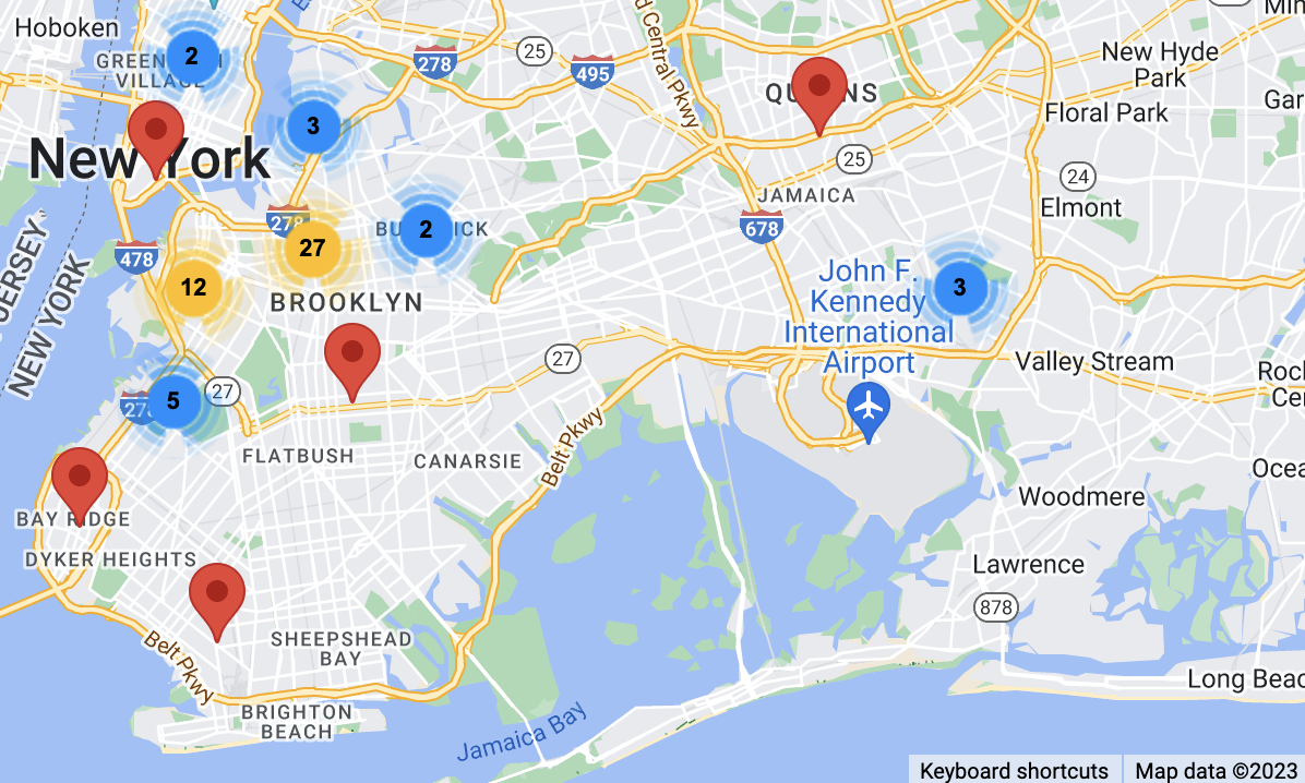
I saw almost immediately that while most of the addresses were correctly placed in Brooklyn, there were a few in Queens and Manhattan. I looked at these data points and looked up the addresses in Google Maps to confirm where they actually were, and they were all in Brooklyn. The addresses that were messed up were the ones that had the aforementioned “two addresses,” or ones that ½ or the E.D. in the address that I could not figure out what it meant. I went back into the table and correctly formatted every address, not cutting any corners this time. I removed all the “h”s that stood for house, added “st” to the end of any address missing it, and removed the ½ and the secondary addresses to ensure nothing would get messed up in any way when mapping each address. This is what the final table now looks like:
When I ran the Geocoder a second time, I saw this:
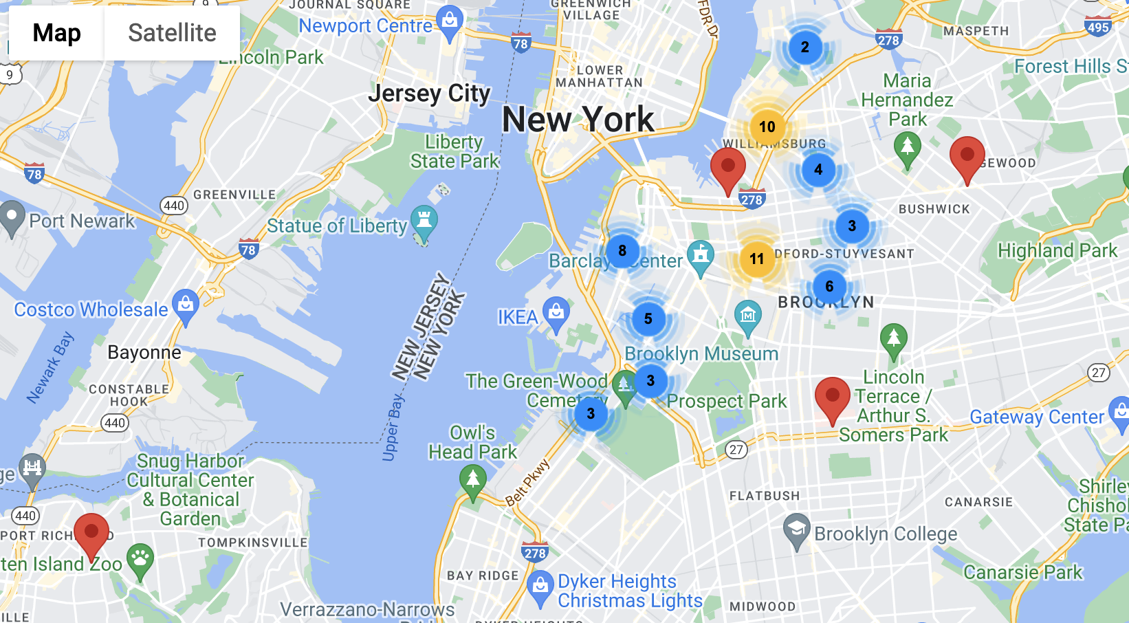
Now every address was correctly placed in Brooklyn, except for one, which was not showing up in Staten Island. This specific address was not one that was misplaced before, it was placed in Brooklyn in the first iteration. The address was for Floyd Street, which strangely enough, I could not find anywhere in Brooklyn. I could not even find a street that had Floyd in it that ended in another street name like Court or Avenue. The only conclusion that I could make was that there was a street in Brooklyn at the time called Floyd Street that no longer exists. My guesses are that the street was either renamed or destroyed, though I’m more inclined to believe the former than the latter.
Visualizing the Data and Conclusions
The last part is to now visualize the data on kepler, which will give me more insight than the simple Awesome Tables map. I downloaded my Sheet as a csv file and plugged it into kepler. After some tinkering, my map came out like this:
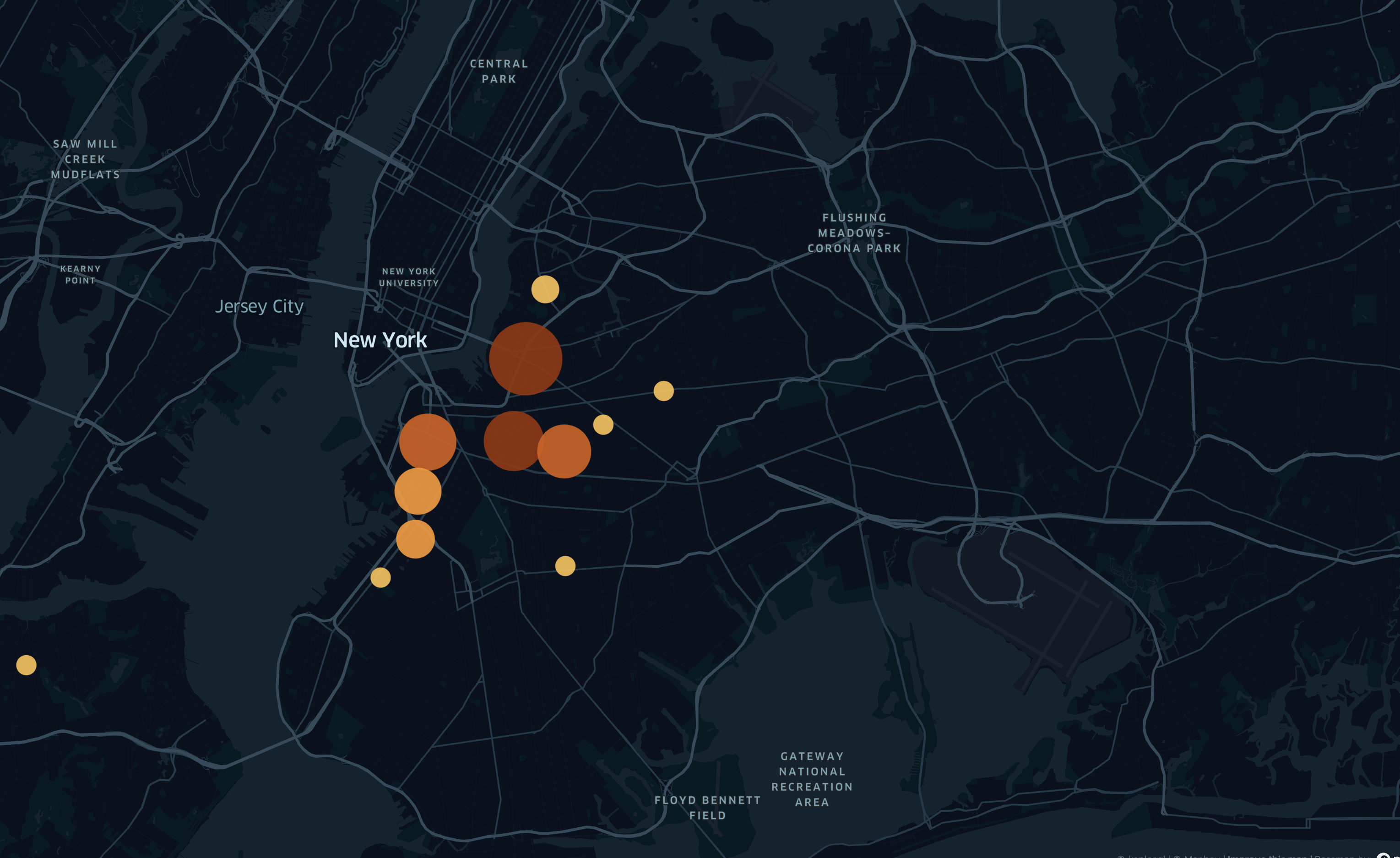
This is a heatmap showing the clusters of addresses, where the larger the circle, the more addresses there are in that area. You can see that all the addresses mapped are in the northern part of Brooklyn, and not the south. Although I live very close to New York City, I don’t actually know much about the history of the city, we only focused broadly on American history in school. After doing some research, I found that areas south of Bedford-Stuyvesant and Prospect Heights (eg. Flatbush or Gravesend) were not actually considered part of Brooklyn at the time, and were instead separate towns. In 1894, 14 years after the publishing of this document, Brooklyn would annex these southern towns, becoming part of New York City. This made me wonder if perhaps my great-grandparents did indeed live in modern-day Brooklyn at the time of this being published, they just lived in an area not considered Brooklyn at the time. Again, I don’t know exactly where or when my great-grandparents lived in New York City, so I can only make assumptions. Now knowing this information about Brooklyn, I concluded that there was not really a more densely populated region of Brooklyn, From what I can see the data points are mostly evenly spread out. After looking at this data, I wanted to next look at a map of all the occupations to see if certain occupations are more likely to appear in one area than another. The map looked like this:
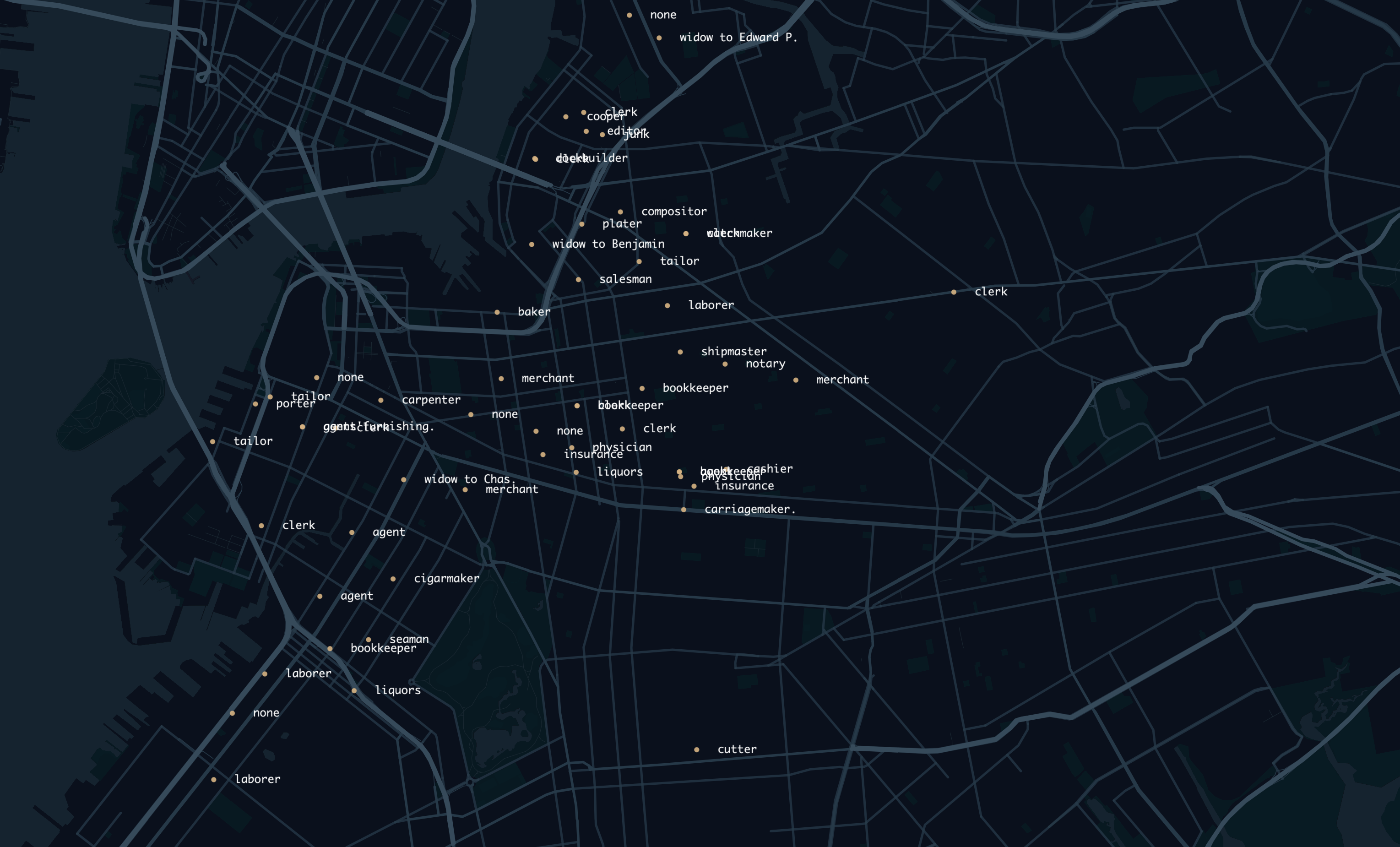
The occupations also don’t really show any correlation between location, probably because of the fact that these are home addresses and not business addresses. It would have been interesting to see if there would be some density of certain job occupations in certain areas based on business addresses, but these are not listed. Overall, due to the small dataset I looked at, it is hard to get proper information or make any conclusions. If I had gone through the painstaking process of tabulating all the information in this document, which I believe would be around 50,000 data points, I would have a lot more to work off of. I think I would be able to see actual population density data in Brooklyn if I were looking at the entire data set much easier. I think if I were to apply these skills to look at some other data set, I think it would be really interesting to map the records of Ellis Island. With this information, you could look at the main countries or areas of a country where people left and immigrated to the US, and what year. I think it would be interesting to see if certain people from certain countries possibly immigrated to the US more during certain years, or if certain countries had a higher amount of people immigrate to the US and measure the percentage of the population that left. Overall, I found this assignment to be very interesting and enjoyed mapping data in a visual and physical way onto a viewable map. I think it would be really interesting to do an experiment similar to this again in the future.